Note
Access to this page requires authorization. You can try signing in or changing directories.
Access to this page requires authorization. You can try changing directories.
Applies to: ✅ Power BI Desktop and Power BI service
This guide covers all matrix visual format settings available when you're editing a report in Power BI Desktop or the Power BI service. Use it to customize layouts, grid settings, column and row headers, subtotals, and more to present your data in the most effective way.
Tips for formatting a matrix
Use the following tips to fine-tune the appearance of your matrix.
Turn off bold labels on subtotals and totals
By default, row labels appear bold when they display in-line with subtotals or totals in the compact layout. To turn off the bold formatting:
- In the format pane, expand Row grand total, Column grand total, Row subtotals, or Column subtotals.
- Expand the Values card and turn off the bold font style.
- Turn on the Apply to labels toggle.
The row labels no longer appear bold. This tip is helpful when you want a mixed state of expand and collapse without the bold differentiating them.

Show columns side by side instead of hierarchically
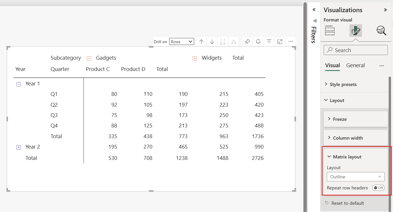
By default, the matrix uses the compact layout, which nests hierarchies with indentation in a single column. To display each level of the hierarchy in its own column:
- In the format pane, expand Layout > Matrix layout.
- Select Outline or Tabular:
- Outline shows totals at the top of each group.
- Tabular shows each hierarchy level in its own column with no indentation.
- To move totals to the bottom in the outline layout, expand Row subtotals > Rows and change Position to Bottom.
Freeze or unfreeze row headers
By default, row headers stay visible when consumers scroll horizontally. You can turn this behavior on or off for different form factors. This option is useful when a matrix appears in both desktop and mobile layouts.
- In the format pane, expand Layout > Freeze.
- Turn the Row headers toggle on or off.
Consider unfreezing row headers for mobile layouts, where portrait orientation limits horizontal space, and keeping them frozen for desktop layouts, which typically use landscape orientation. Report consumers can also right-click a matrix to transiently freeze or unfreeze the row headers for their current viewing session.

Format settings for matrix visuals
Style presets
Style
Use the Style setting to choose from a set of predefined styles with unique combinations of colors and formatting. To change the overall look of your matrix visual, apply one of these styles with a single click. These styles include:
- Default
- None
- Minimal
- Bold header
- Alternating rows
- Contrast alternating rows
- Flashy rows
- Bold header flashy rows
- Sparse
- Condensed
- None sparse
- None condensed
Layout
Freeze
Use the Freeze settings to control whether row headers stay visible when consumers scroll horizontally.
Row headers
Turn on this toggle to keep the row headers visible when the matrix scrolls horizontally. Turn off this toggle to hide the row headers as the matrix scrolls. Report consumers can also right-click a matrix to transiently freeze or unfreeze the row headers for their current viewing session.
Column width
Use the Column width settings to control how columns size, set a default width, and customize widths for individual columns.
Auto-size behavior
Choose how columns size to fit the visual:
- Fit to content: Columns are as wide as they need to be to show the data, assuming there's room in the visual container.
- Grow to fit: Columns automatically expand to fill the visual container for a more balanced layout. Any leftover horizontal space is distributed evenly to each column.
- Fixed width: Columns use a width that you specify. When you select this option, a Default width input appears so you can set the width for all columns and for any new columns added to the visual.
Default width
When Auto-size behavior is set to Fixed width, set a Default width in pixels. With Custom widths off, all columns use this uniform width. New columns added to the visual also use this default width.
Custom widths
Turn on this toggle to see and customize the width of any column directly from the format pane. If the visual has fewer than 15 columns, each column appears with its own width input. If the visual has 15 or more columns, an Apply settings to dropdown appears. Columns that already have a custom width are marked with an asterisk (*). Width inputs that show (auto) indicate the column is using the auto-size behavior rather than a custom width.
Turn off this toggle to clear any custom widths on the matrix.
Matrix layout
Layout
The Layout menu offers three options for customizing the presentation of your data:
- Compact: The default space-saving layout where row labels display in a single column. The hierarchy shows through indentation. Use this layout to display more data in less space.
- Outline: Each level of the hierarchy appears in its own column. This layout works like a traditional pivot table, so it's easy to read and understand the hierarchy at a glance.
- Tabular: Similar to the outline layout but without indentation. Each hierarchy level is still in its own column, but the data is presented in a flat structure.
Repeat row headers
This toggle controls whether the row headers repeat on each page of a paginated report. When enabled, the row headers appear at the top of each page. This setting helps maintain context when a matrix spans multiple pages.
Grid
Horizontal gridlines
Turn on the Horizontal gridlines toggle to add lines horizontally across the chart. These lines improve readability and visually separate data points. You can also adjust the line color and width.
Color
This setting allows you to customize the color by selecting colors from the color palette.
Width
The Width setting allows you to define the thickness in pixels, offering a range from 1 to 10 (widest).
Vertical gridlines
Turn on the Vertical gridlines toggle to add lines vertically across the chart. These lines improve readability and visually separate data points. You can also adjust the line color and width.
Color
This setting allows you to customize the color by selecting colors from the color palette.
Width
The Width setting allows you to define the thickness in pixels, offering a range from 1 to 10 (widest).
Border
Use the Border settings to customize the appearance of the borders around the matrix and its individual sections.
Selection
Use this menu to define the borders for different sections of the matrix. Here's what each option in the Section menu means:
- All: Applies the border settings to the entire matrix, including column headers, row headers, and the values section.
- Column header: Applies the border settings only to the column headers of the matrix.
- Row header: Applies the border settings exclusively to the row headers of the matrix.
- Values section: Applies the border settings only to the area of the matrix where the data values are displayed.
Position
Choose from four options to specify the position of the border:
- Top
- Bottom
- Left
- Right
Color
This setting allows you to customize the color by selecting colors from the color palette.
Width
The Width setting allows you to define the thickness in pixels, offering a range from 1 to 10 (widest).
Options
The Options menu includes options for row padding and global font size. Adjust the spacing and text size within the matrix visual.
Row padding
This setting controls the amount of space between rows. It often makes the matrix easier to read by adding more white space. Decreasing it can make the matrix more compact.
Global font size
This setting changes the font size for all text within the matrix visual. Increasing the font size can improve readability, especially when presenting to an audience or for users with visual impairments. Decreasing it can allow more data to be displayed on the screen.
Blank rows
Use the Blank rows toggle to add blank rows within the matrix. These blank rows separate higher-level row header categories, which can make the report easier to read and better organized. When you turn on this feature, you can customize the appearance of these rows by using the available settings.
Color
Color
This setting allows you to customize the color by selecting colors from the color palette.
Transparency
The Transparency setting allows you to adjust the transparency level, ranging from 0% for full opacity to 100% for complete transparency, enabling you to achieve either a subtle or a more pronounced effect.
Border
Use the Border settings to customize the appearance of the borders around the blank rows.
Position
Choose from three options to specify the position of the border:
- Top
- Bottom
- Top and bottom
Color
This setting allows you to customize the color by selecting colors from the color palette.
Transparency
The Transparency setting allows you to adjust the transparency level, ranging from 0% for full opacity to 100% for complete transparency, enabling you to achieve either a subtle or a more pronounced effect.
Width
The Width setting allows you to define the thickness in pixels, offering a range from 1 to 10 (widest).
Values
Text
Font
The font’s appearance is determined by three distinct controls:
- Font family: Select from preset font families.
- Font size: Font size can be adjusted within a range of 8 to 60 points.
- Font style: With normal being the default, you can also choose bold, italic, or underlined.
Text color
This setting allows you to customize the color by selecting colors from the color palette.
Background color
This setting allows you to customize the color by selecting colors from the color palette.
Alternate text color
Select a color from the palette to customize the color for alternating rows.
Alternate background color
Select a color from the palette to customize the color for alternating rows.
Text wrap
Turn on this toggle to display longer text on multiple lines within a cell, so the text doesn't get cut off.
Options
Switch values to rows
Turn on this toggle to switch the display of your values from columns to rows within the matrix.
Column headers
Text
Font
The font’s appearance is determined by three distinct controls:
- Font family: Select from preset font families.
- Font size: Font size can be adjusted within a range of 8 to 60 points.
- Font style: With normal being the default, you can also choose bold, italic, or underlined.
Text color
This setting allows you to customize the color by selecting colors from the color palette.
Background color
This setting allows you to customize the color by selecting colors from the color palette.
Header alignment
This setting controls the header alignment. Choose left, center, or right.
Title alignment
This setting controls the title alignment. Choose left, center, or right.
Text wrap
This toggle, when enabled, allows longer text to automatically continue, or wrap, onto the next line when it reaches the limit of the space allocated.
+/- icons
Color
This setting allows you to customize the color by selecting colors from the color palette.
Expand/collapse icon size
Use this setting to customize the size, offering a range of 8 to 60 pixels.
Options
Auto expand
Turn on this toggle to automatically expand all column header levels when the visual loads. When disabled, column headers start collapsed and users can expand them manually. For more information, see Expand and collapse row and column headers.
Row headers
Text
Font
The font’s appearance is determined by three distinct controls:
- Font family: Select from preset font families.
- Font size: Font size can be adjusted within a range of 8 to 60 points.
- Font style: With normal being the default, you can also choose bold, italic, or underlined.
Text color
This setting allows you to customize the color by selecting colors from the color palette.
Background color
This setting allows you to customize the color by selecting colors from the color palette.
Banded row color
When you turn on this toggle, it extends the color settings from the Values section, and applies the same color format settings to the row headers in your matrix.
Alignment
This setting controls the alignment, allowing you to choose between left, center, or right.
Text wrap
This toggle, when enabled, allows longer text to automatically continue, or wrap, onto the next line when it reaches the limit of the space allocated.
+/- icons
Color
This setting allows you to customize the color by selecting colors from the color palette.
Expand/collapse icon size
Use this setting to customize the size, offering a range of 8 to 60 pixels.
Options
Auto expand
Turn on this toggle to automatically expand all row header levels when the visual loads. When disabled, row headers start collapsed and users can expand them manually. For more information, see Expand and collapse row and column headers.
Column subtotals
The Column subtotals toggle controls whether subtotals appear for columns in your matrix. When you turn it on, Power BI calculates and displays subtotals for each column based on the underlying data. Turn off this toggle if you want to hide column subtotals. To find this setting, select the Format visual icon in the Visualizations pane, then expand Column subtotals.
Apply settings to
Per column level
Enable this toggle to customize subtotals for individual columns.
Column level
Use this menu to set subtotal options for the entire column.
Columns
Show subtotal
This toggle controls whether subtotals are visible. When enabled, subtotals are calculated based on the underlying data.
Subtotal label
This toggle controls whether subtotals are visible. When enabled, subtotals are calculated based on the underlying data.
Values
Font
The font’s appearance is determined by three distinct controls:
- Font family: Select from preset font families.
- Font size: Font size can be adjusted within a range of 8 to 60 points.
- Font style: With normal being the default, you can also choose bold, italic, or underlined.
Text color
This setting allows you to customize the color by selecting colors from the color palette.
Background color
This setting allows you to customize the color by selecting colors from the color palette.
Apply to labels
This toggle, when enabled, extends the formatting settings (font, text color, and background color) to the labels.
Row subtotals
The Row subtotals toggle controls whether subtotals appear for rows in your matrix. When you turn it on, Power BI calculates and displays subtotals for each row based on the underlying data. Turn off this toggle if you want to hide row subtotals. To find this setting, select the Format visual icon in the Visualizations pane, then expand Row subtotals. Row and column subtotals apply to the matrix visual, which groups data into nested rows and columns. The table visual displays a single grand total row rather than subtotals.
Apply settings to
Per row level
When enabled, this toggle lets you customize subtotals for individual rows.
Row level
Use this menu to set subtotal options for the entire row hierarchy.
Rows
Show subtotal
This toggle controls whether subtotals are visible. When enabled, subtotals are calculated based on the underlying data.
Subtotal label
This toggle controls whether subtotals are visible. When enabled, subtotals are calculated based on the underlying data.
Position
Specify the position of the subtotal labels:
- Top
- Bottom
Values
Font
The font’s appearance is determined by three distinct controls:
- Font family: Select from preset font families.
- Font size: Font size can be adjusted within a range of 8 to 60 points.
- Font style: With normal being the default, you can also choose bold, italic, or underlined.
Text color
This setting allows you to customize the color by selecting colors from the color palette.
Background color
This setting allows you to customize the color by selecting colors from the color palette.
Apply to labels
This toggle, when enabled, extends the formatting settings (font, text color, and background color) to the labels.
Column grand total
Values
Font
The font’s appearance is determined by three distinct controls:
- Font family: Select from preset font families.
- Font size: Font size can be adjusted within a range of 8 to 60 points.
- Font style: With normal being the default, you can also choose bold, italic, or underlined.
Text color
This setting allows you to customize the color by selecting colors from the color palette.
Background color
This setting allows you to customize the color by selecting colors from the color palette.
Apply to labels
This toggle, when enabled, extends the formatting settings (font, text color, and background color) to the labels.
Row grand total
Values
Font
The font’s appearance is determined by three distinct controls:
- Font family: Select from preset font families.
- Font size: Font size can be adjusted within a range of 8 to 60 points.
- Font style: With normal being the default, you can also choose bold, italic, or underlined.
Text color
This setting allows you to customize the color by selecting colors from the color palette.
Background color
This setting allows you to customize the color by selecting colors from the color palette.
Apply to labels
This toggle, when enabled, extends the formatting settings (font, text color, and background color) to the labels.
Grand total color behavior
Grand total color settings
If you don't explicitly define a grand total text color, the grand total automatically inherits the subtotal text color.
- The grand total text color doesn't support an undefined state.
If you don't explicitly set the grand total background color, the grand total inherits the background color from the subtotal.
- Unlike text color, the grand total background color supports an undefined option.
Note
These color inheritance behaviors are currently under review and might change in future versions. To avoid unintended styling, always explicitly define any grand total colors.
Specific column
Apply settings to
Specific column series
Select individual columns (series) within your matrix, and apply specific formatting. Customize colors, font sizes, or conditional formatting rules for each column separately.
Apply to header
When you enable this toggle, any formatting settings you apply affect the column headers (the labels at the top of each column). You can adjust font styles, alignment, and other visual properties for the headers.
Apply to subtotals
When you enable this toggle, it applies formatting settings to the subtotal rows within your matrix. Customize how subtotals are displayed, including font colors, background colors, and font sizes.
Apply to total
Similar to subtotals, this option lets you format the total row (if you have one) in your matrix. You can control font styles, colors, and other visual aspects for the total row.
Apply to values
When turned on, this toggle applies formatting rules to the actual data values within the matrix cells. You can set up conditional formatting, color scales, or other visual cues based on the data values.
Values
Text color
This setting allows you to customize the color by selecting colors from the color palette.
Background color
This setting allows you to customize the color by selecting colors from the color palette.
Alignment
This setting controls the alignment, allowing you to choose between left, center, or right.
Display units
The menu offers several options for defining the display units:
- None: Displays the value as is, without any unit.
- Thousands: Divides the value by 1,000 and appends a "K" suffix.
- Millions: Divides the value by 1,000,000 and appends an "M" suffix.
- Billions: Divides the value by 1,000,000,000 and appends a "B" suffix.
- Trillions: Divides the value by 1,000,000,000,000 and appends a "T" suffix.
Value decimal places
Specify the number of decimal places for values, with a selectable range from 0 to 15.
Cell elements
Use the Cell elements settings to apply conditional formatting to values in your matrix. For more information, see Conditional formatting in Power BI visuals.
Apply settings to
Series
Select the data series that you want to apply formatting options to.
Background color
When you turn on this toggle, you can customize the background color by using conditional formatting.
Font color
When you turn on this toggle, you can customize the font color by using conditional formatting.
Data bars
When you turn on this toggle, you can use conditional formatting to create horizontal bars that reflect the magnitude of data points. For example, longer bars for higher values.
Icons
Turn on this toggle to use conditional formatting to add visual indicators from a predefined set of icons or custom icons. For example, an up arrow for positive growth and a down arrow for negative growth. By using the Field value format style, you can also point to a column of image URLs, including links to image files in OneLake, to display custom icons.
Web URL
When you turn on this toggle, you can use conditional formatting to embed web URLs, creating clickable links that lead to external websites or internal resources. For instance, link a product name to its detailed page on an internal or external website.
URL icon
Values
When you turn on this toggle, you can create hyperlinks within individual cells. You can associate a URL field with specific data points for users to navigate to external web pages or resources.
Column headers
When you turn on this toggle, you can replace the column header text with a clickable hyperlink icon. This replacement is useful when you want to link to additional information related to the column or provide context-specific URLs.
Row headers
When you turn on this toggle, you can replace the row header text with a clickable hyperlink icon. Users can click on the icon to access relevant URLs associated with each row.
Image size
Height
Use this setting to define the height of the image, offering a range of 8 to 512 pixels.
Width
Use this setting to define the width of the image, offering a range of 8 to 512 pixels.
Sparklines
Apply settings to
Sparkline
Use this dropdown to select the sparkline you want to format.
Sparkline
Chart type
Choose the visual style for the sparkline:
- Line
- Column
Data color
Select a color for the sparkline data.
Color
This setting allows you to customize the color by selecting colors from the color palette.
Width
Adjust the thickness of the sparkline line or the width of the columns.
Marker
Show these markers
Turn on markers to highlight specific points on the sparkline:
- Every point
- Highest
- Lowest
- First
- Last
- Negative
- Isolated
Color
Select a color for the markers.
Color
This setting allows you to customize the color by selecting colors from the color palette.
Type
Choose a basic shape for the marker, such as circle, square, or others.
Size
Adjust the size of the markers.